civian.com

civian.com

Usability Testing
Civian
Boosting activation by enhancing usability and decision-making
Krathish Prakash
Design & Research
civian.com
Project Brief
My role
UX Design & Research --- UXR Methods, Ideation, Interaction Design and Prototyping
Team
Ha Do, UXD&R
Nisheta Gupta, UXD&R
Qasim Malik, UXD&R
Madhav Tankha, Mentor & supervisor
Timeline
4 months, Oct - Dec ‘24
Overview
Civian is a digital platform that enables companies to measure the social impact of their investments in communities and make data-backed decisions of capital deployment to maximize ROI. By quantifying the impact businesses have on the communities they serve, Civian offers a unique and novel approach to investing.
Our usability testing revealed significant challenges impacting their ability to fully engage with the platform. Issues such as the lack of advanced filtering options, limited map functionality, and the absence of a comparison feature hindered user activation and retention. Additionally, users struggled with understanding key metrics, connecting insights, and accessing help resources. This case study explores how targeted design interventions—such as implementing advanced filters, introducing a comparison tool, and enhancing usability through contextual onboarding—addressed these challenges.
Chapter 1 -- Kickoff
We first met with Civian for an exploratory session. Three members of Civian's product and data teams joined our team on the call.
Key highlights of exploratory session
Success of the product. Civian defined product success as efficient product use as a leading indicator and hoped rising renewal rate to reflect that as a lagging indicator.
Target audience. Credit union executives had been chosen for the MVP's testing phase because they believed they had a unique need for investing in underserved communities.
Competitors. Civian's product was unique in that it combined economic impact measurement with social ROI, but there were other players in the market. Implan, an economic research tool with some social impact features, was a major competitor.
No clear problem statement. Civian's team was building a solution to a problem that they weren't really clear about, and any vague problem they could think of, they weren't sure it existed in the market.
Research goals
What areas is our study going to focus on?
After our exploratory call, we started to work on setting scope. Clear research goals provide direction and focus for your research, ensuring that every effort contributes towards meaningful, impactful findings. After a few back and forth communications, we distilled it to the following
Research goals
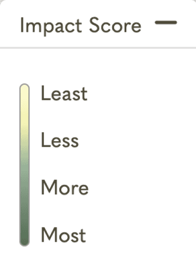
Determine if the terms and concepts in the platform are clear to users (vulnerabilities, impact score, reach of capital, etc.).
Understand if the interface is usable (ease of navigation, efficiency of task completion, and pain points).
Determine if users are able to understand the presented data.
Understand what additional depth users seek in the data – where do they want to dive in, and what interactivity do they desire.
Chapter 2 -- Planning
Now that we had our goals sorted, it was time to recruit users for usability testing.
To find participants from the target user group, we utilized a multiple choice screener — only individuals who had experience with CSR, data analysis, and/or social outreach for NPOs were accepted into our study.
Demographic details
CSR specialist, data analysts, account supervisor, NPO co-founder, data scientist
4/8 located in the northeast area
NPOs, finance - technology, law, education
Identifying themes
We conducted thematic analysis (affinity mapping) on the insights to identify overarching patterns in user behavior and pain points.
Insights
Design impact
Users couldn’t compare locations or break down key metrics for more detailed information, such as expanding "Organizations" to see a list of specific entities.
Intuitive comparison tabs, ability to view organizations
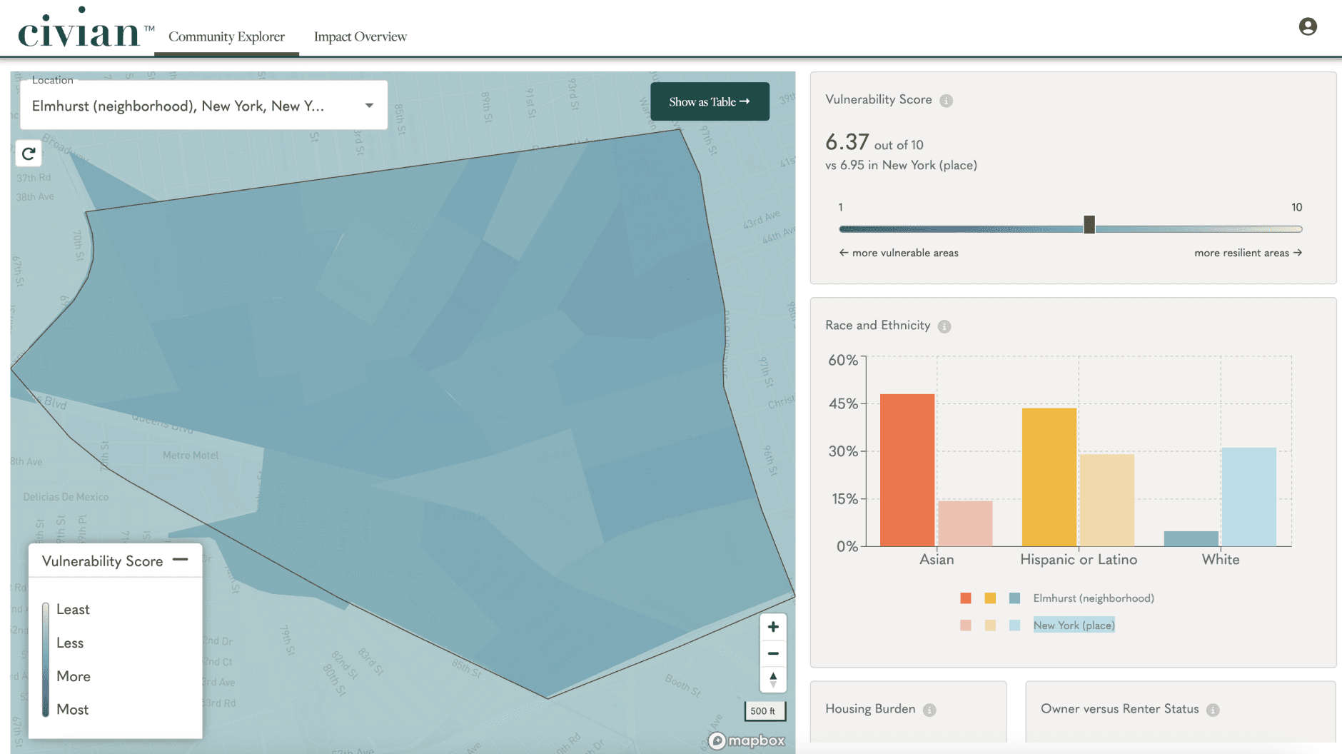
Users experience difficulty with visualizations and interacting with spatial data on the platform due to limitations in the current map design and functionality.
Improved color system, loading indicator
The dashboard lacked advanced filtering options to focus on specific issues, making it difficult to locate relevant data or incorporate new desired metrics.
Ability to filter by vulnerability score, new key metrics
Users faced several barriers while gaining deeper insights and clarity when exploring the platform's data, which limits their ability to fully understand and act on the information presented.
Increasing discovery of help, added contextual onboarding
We spoke to 8 distinct users
Chapter 3 -- Execution
We used the insights gained to create recommendations to fix those issues.
civian.com


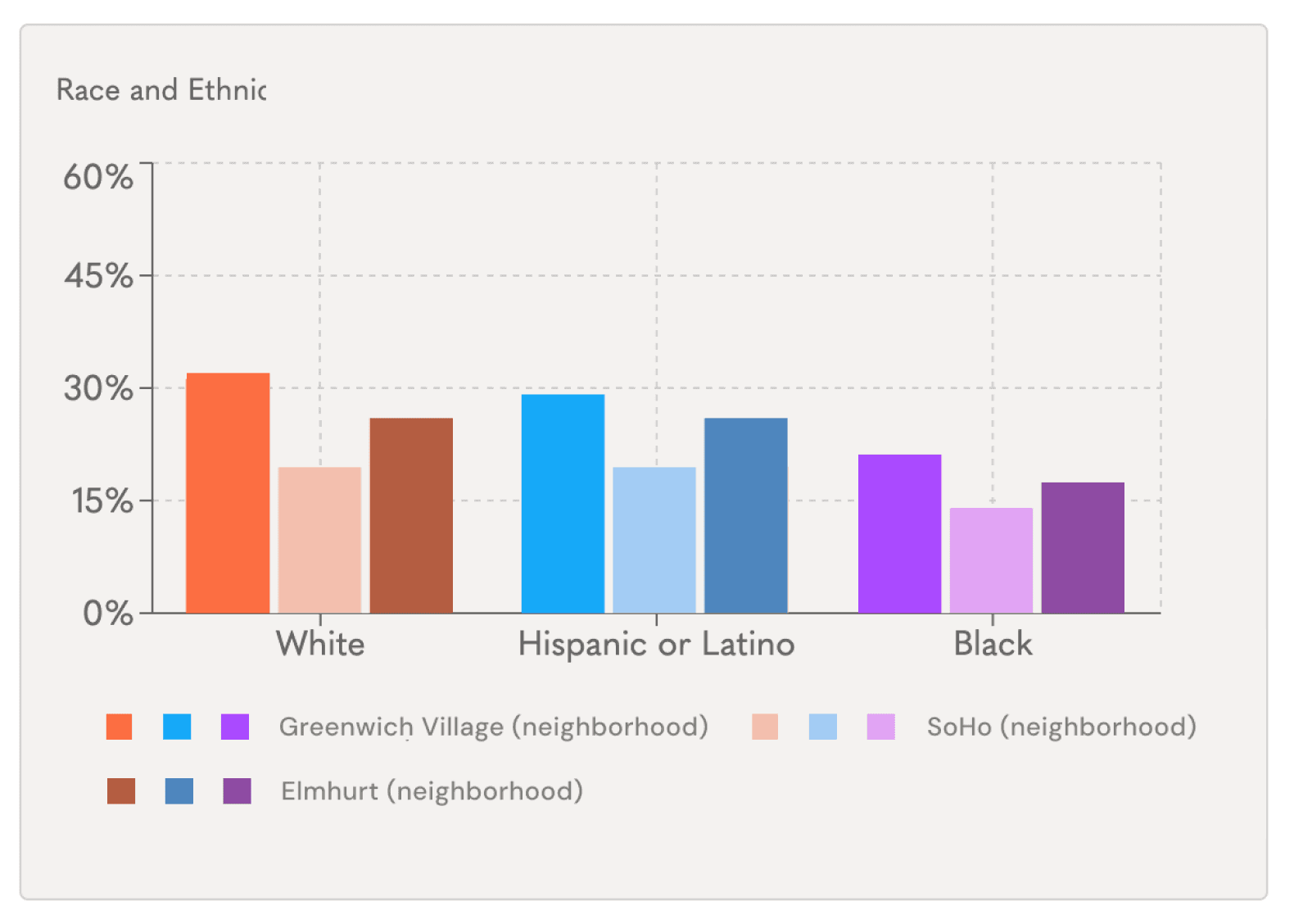
Compare locations
Greenwich Village
vs
Elmhurst
vs
SoHo

more vulnerable areas
67%
45%
Vulnerability Score
7.59
out of 10
GREenwich village
6.95
out of 10
ELMHURST
3.69
out of 10
Soho

6.95
7.59
3.69
filter


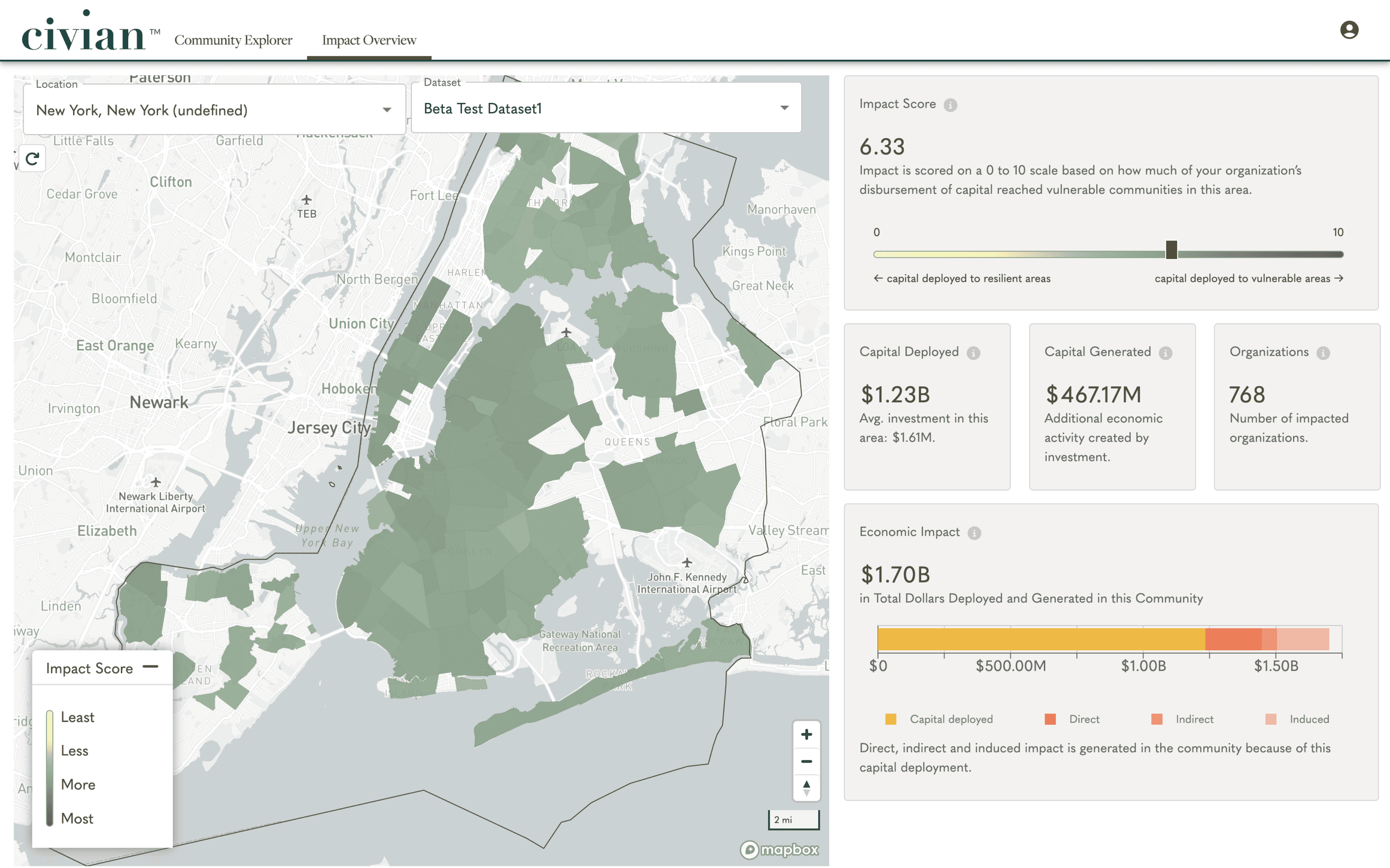
We’ve cleaned up the map’s boundaries with trimming and dashed borders and made it overall more readable
Improved map system
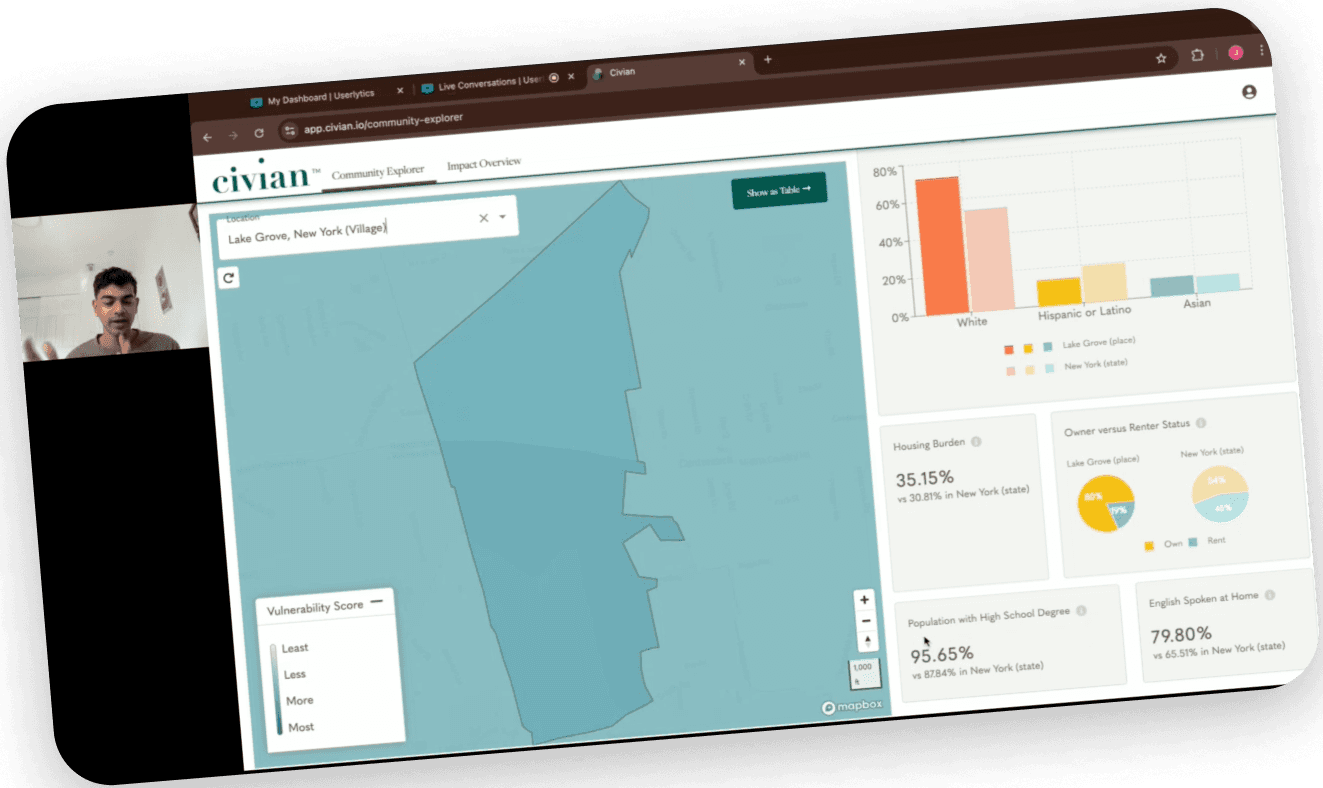
We’ve designed to enable easy comparison between how many ever locations users wish to compare. This comparison is seen on the map and the data on the right.
Comparing locations
We’ve changed the colors of the racial groups and owner vs renter status to be a different color from the map. Creating lesser unwanted association.
New color system
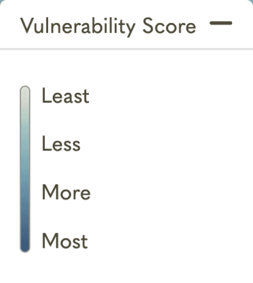
We’ve made the vul. score viz. as visibly non-interactive, and we’ve added a button to turn it into a filter which allows you to slide and filter by vulnerability score (seen in the next screen)
Advanced filtering
civian.com
See on map
Alphabet LLC
Abet LLC
LLC
Jack’s Bar
RR Bar
Jack’s Bar
FC Credit Union
A Credit Union
XYZ Credit Union
Martha’s Salon
Martha’s Salon
Mat’s Salon
Salon
We’ve added better search suggestions and close matches, as well as a loading indicator to let the user know they’re action is being processed (seen in prototype)
Better search system
We’ve expanded the map to include organization’s location and name. This allows users to make more informed decisions of which businesses succeeded and where exactly.
Expansive data
Few key issues are highlighted below, tap on pills to expand.
civian.com

The map had a bunch of issues ranging from confusing lines and poor readability.
Lack of informative map
There is currently no way users can compare between two locations efficiently, without going back and forth.
No way to compare
This visualization of vul. score was mistaken to be a slider by almost all users.
Misleading slider
The map had a bunch of issues ranging from confusing lines and poor readability.
Confusing color system
The search could be improved by adding a loading indicator and search suggestions.
Search issues
Here is a prototype, showcasing all the new improvements.
Chapter 4 -- Retrospective
Conclusion
The final prototype and designs were delivered to the client. This was accompanied with a detailed report.
Our hope is that with these recommendations user activation is boosted by users who can now interact with Civian more efficiently.
I personally learnt and honed a range of skills from collaboration and communication to UX research methodologies to pixel-perfect design execution.
All of this wouldn’t have been possible without the help of my amazing teammates, professor and the Civian team!
We love the map enhancements and the addition of the compare tab! These were features we had been considering as well but were unsure about how to implement them. Fantastic job!
- S. D'Alessio, Chief Product officer at Civian
You've reached the end, how about another read?